|
|
Post by fin5iver on Jan 22, 2004 10:26:10 GMT
how do you get rid of the slider bar thingy between frames? Do you mean the scrolling thing? Then put SCROLLING="no" in the frame tag. |
|
|
|
Post by lisa555 on Jan 22, 2004 14:50:19 GMT
It's a cool site, i love the black and red  |
|
Junie
new fan
 *it wasn't me!*
Posts: 145
|
Post by Junie on Jan 22, 2004 15:58:38 GMT
No I meant when I building my own site... I cant find a code to get rid of the seperator line/bar type thing... well seein as this is a topic talkin about ritchie's site, you didn't say it was for one of your own, lol. soz. |
|
Scorpion
fan
Freedom is a choice you make inside
Posts: 622
|
Post by Scorpion on Jan 22, 2004 18:46:25 GMT
I like that new peace sign on the main page ;D
|
|
Scorpion
fan
Freedom is a choice you make inside
Posts: 622
|
Post by Scorpion on Jan 22, 2004 19:48:22 GMT
I see the webmaster's doing something new every minute lol
This grey background for the the cells when you have the mouse over them is cool too
|
|
|
|
Post by fin5iver on Jan 22, 2004 20:07:07 GMT
Yeah it makes the board look a lot more nicer  |
|
Rotae
excellent fan
D.W.A.P & I.H.T.F.W. Tasmania: The Land Under The Land Down Under!
Posts: 2,615
|
Post by Rotae on Jan 22, 2004 23:33:21 GMT
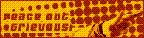
I agree with scorpion. The peace sign rocks!
Peace (out, Rock out! lol),
Rotae
|
|
Scorpion
fan
Freedom is a choice you make inside
Posts: 622
|
Post by Scorpion on Jan 23, 2004 20:24:54 GMT
just seen the new logos on the website and they rock ;D
|
|
Rotae
excellent fan
D.W.A.P & I.H.T.F.W. Tasmania: The Land Under The Land Down Under!
Posts: 2,615
|
Post by Rotae on Jan 24, 2004 3:00:49 GMT
I really like the logo, I've already added it to my website I also really like the one with 'once a popstar, always a popstar... well, not always'. It's really cool. I like the slogan. Peace, Rotae |
|
Mrs J.Brown
new fan
Wanted: J Naked. Will Pay Cash!
Posts: 152
|
Post by Mrs J.Brown on Jan 24, 2004 9:02:59 GMT
Okay I'm going to try word this as nice as I can. Here goes LOL:
I have to say I really like the board without the highlights. I think they look well ... unprofessional (let's just say I think if we can't use them in our text then perhaps setting an example would be good. Like having CAPS all over the website. In the rules it says "it's like internet yelling", yet their screaming all over the site. Kind of rude)
Also about the chatroom. Most people on absessive didn't like or couldn't get into bravenet so I was wondering if there'll be a decent one soon?
Can I just say this is starting to look alot like absessive. I guess I thought Ritchies site would be 'uniquely' Ritchie.
(okay I'll probebly edit this later once I read it a few times so it sounds better)
|
|
|
|
Post by Webmaster on Jan 24, 2004 9:29:28 GMT
The bravenet chat's free and that's what we can afford. I don't think there will ever be another one.
The all CAPS in the website is so people who set their fonts to small in their browser or have small screens can read it. It's only rude when one person does it and others can't in the same place, as in a chat, board or guestbook.
I have no idea what the rest of what you said means.
Boards everywhere are very similar... v bulletin boards, pro-boards, ezboards. They all configure about the same way so most of them look a lot alike except for colors etc. For starters, Abs' board is screaming white and has a big extra menu down the left side of the page. We'll probably get one too when I figure out how to do it and have all those little extra things to put up there like Abs has.
|
|
Mrs J.Brown
new fan
Wanted: J Naked. Will Pay Cash!
Posts: 152
|
Post by Mrs J.Brown on Jan 24, 2004 9:33:07 GMT
Oh okay. I didn't know about the small fonts thing. I'd never heard of that before.  |
|
|
|
Post by Becky on Jan 24, 2004 16:17:50 GMT
I didnt know either. Learn something new everyday eh?
|
|
Jac
new fan
Lost inside these thoughts of you
Posts: 54
|
Post by Jac on Jan 24, 2004 17:22:40 GMT
I don't think looks like Abs' site. I suppose it's early days yet, and things will change as time goes on. Angelz.I've never seen u on absessive. I'm presuming you are registered under a different name there |
|
Junie
new fan
*it wasn't me!*
Posts: 145
|
Post by Junie on Jan 24, 2004 18:11:55 GMT
Interestin new button things that have popped up, up there *points to top of board* and around the rest of the place. I noticed we've got circles now instead of stars too lol. Not sure about them at the minute, but i'll get used to them. Maybe the content is similar to Absessive, but that's probably cos what they've got on Absessive works well... the colours here are to go with the design of the site after all. I'm sure if it ever gets a redesign the board will change with it (as did the Abs one). That's all the similarities I see really.  |
|